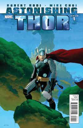
Meant to be strong continuity-light minis, Marvel’s ‘Astonishing’ line adds another book this week with “Astonishing Thor” #1, an issue that doesn’t have much of anything ‘astonishing’ about it. Instead there’s a hint of a plot, a hint of some characterization, some of the worst over-the-top faux-lofty Asgardian dialogue published since the late ’60s, and art that tries to mimic the look of painted fantasy art in every way including painfully static pictures (in a sequential narrative) and excluding using actual paints. No, the only astonishing thing about this comic is that it got made.
The issue begins with bombast spewing from Thor as Manhattan experiences what resembles a giant tidal wave in the middle of a thunder storm, but it’s hard to tell because, before it’s established as a threat, it’s over. From there, Thor receives a couple of clues of the source of the disturbing weather: one an old flame, the Elemental Zephyr, the other something approaching Earth from deep space. The threat is barely discussed and the causes are only hinted at, even when Thor confronts one directly. Obviously, this issue is meant to set up the ensuing plot, but the set-up is so thin that it’s difficult to tell what is being set up, why it involves Thor specifically, or where the book goes from here.
Thor’s dialogue is particularly grating, which is a surprise as Robert Rodi’s Asgardian vernacular isn’t this over-the-top in “Thor: For Asgard” where the context would allow for such flourishes. The way Thor and Heimdall speak here feels out of touch with how they’re written usually that it’s very distracting. It’s purple prose dialogue that uses eight words when one would do, and doesn’t add flavor or texture to the characters, it comes off as labored and forced. Every sentence is stilted and stiff, coming out unnaturally.
Mike Choi’s art has a similar effect, though it does have a different look in some ways to his usual art. Without Sonia Oback on colors, Choi’s pencils come through a little more, not looking as slick. The line work on the first page shows more texture and individual lines than is usually apparent in his art, which fits the material. Still, his art has a very staged and posed look, every image disconnected from those that surround it, often from the context of the comic. That opening splash doesn’t fit with the next page. Thor looks so calm and serene despite there being a massive tidal wave he has to stop. How does that work?
Frank D’Armata’s colors look to mimic a painted style, but fail utterly, instead looking like bad computer coloring trying to look like painted art. It’s a poor imitation that works rarely and, like the purpose prose dialogue, distracts greatly for its forced and unnatural feeling.
“Astonishing Thor” #1 is astonishingly bad. There’s barely a story, groan-inducing dialogue, stiff art, faux-painted colors, and it makes for an unimpressive start. While not tying directly into current continuity, this comic does rely on Marvel continuity heavily and is meant to be the Thor of the Marvel universe, but doesn’t sound or even act like him. Of the current crop of Thor titles, this is, by far, the worst.

