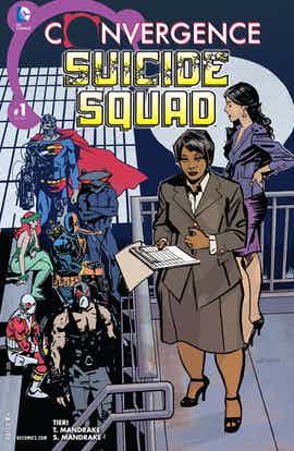
The ’80s and early ’90s version of the Suicide Squad, helmed by John Ostrander and Kim Yale, is still fairly beloved by fans, and with good reason. Ostrander, Yale and their artistic collaborators understood the balance between missions in the field and the scheming, plotting and interplay between all the characters. So, while it’s a genuine shame that John Ostrander isn’t writing “Convergence: Suicide Squad” #1 (especially since he was willing to come back for the “Suicide Squad” issue in “Blackest Night”), here’s the good news: Frank Tieri, Tom Mandrake and Sian Mandrake do their best to pick up the torch.
Tieri gets that Suicide Squad should be more than just shipping off villains to shoot and punch one another, and we get an appropriate opening sequence where we see what life is like in the Metropolis dome. It’s entertaining in part because of how Deadshot and Captain Boomerang have adjusted to life here (even as we’re reminded that, in many ways, they haven’t changed at all) and in part because of the little touches, like the discussion on the different meats — real and artificially manufactured — that now exist in Metropolis.
There’s a lot of setup going on in “Convergence: Suicide Squad” #1. In fact, there’s actually a little too much in places; as fun as it is to see the rundown of all of the members (old and new), it’s hard to keep from wishing that we’d actually see some of them do something by the end of the issue. That said, it almost gets balanced out thanks to the big reveal at the end of the issue. It’s a vintage Squad moment, one where there’s a surprise lurking around the corner and it’s a face you’d never expect to see. It’s a fun surprise, one that I’m looking forward to seeing play out next month.
While Mandrake never worked on “Suicide Squad,” he was a long term collaborator with Ostrander on “The Spectre” and “Martian Manhunter” and he’s a good choice for this comic. His art, as always, is very smooth and attractive; you can almost imagine the pencil rubbing off on your fingers as you touch the pages. What really grabs my attention here is how well Mandrake can handle the darker moments of the comic. When Amanda Waller and company are standing on the grate over the containment cell, it’s really well staged. The chains coming in from all sides are impossible to ignore even as they work well with the background, and each of the three prisoners have their own particular stance and body language, so that you can tell at a glance who is who. Sian Mandrake handles the colors and she’s good, too; the orange is a perfect dull shade, and the browns down below mesh well with the light green from up above. When the two Mandrakes collaborate for that last page, it’s a show-stopper with that grin on the character’s face, the gold radiating off of the ring and the overall chilling effect when the reader realizes just what the final member of the team is up to.
It’s easy to see why “Suicide Squad” was chosen for “Convergence.” Not only is there a film coming out, but it’s a concept that’s well-beloved, especially for people starving for the original Squad that they loved to read about. Overall, so far, so good. A lot will depend on what happens next month with the conclusion but, at the moment, I’m pleasantly pleased with “Convergence: Suicide Squad” #1. It’s a nice trip down memory lane.

